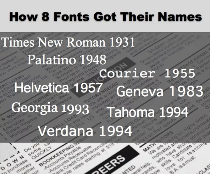
Typeface Versus Font
First, we have to talk about the difference between a typeface and a font, because what we’re really talking about here is the names of typefaces.
Think of it this way: the font is a small part of a typeface. If we’re talking about Times New Roman, Times New Roman 12 point bold italic is the font, and the typeface is the collection of all the fonts that make up the entire Times New Roman set. Today, however, many people think of letter styles as fonts because it’s the word you see on all your software menus.
1931 Times New Roman
Times New Roman is the oldest typeface on my list. It was created in 1931, and its name makes sense when you realize it was designed for the British newspaper The Times.
Times New Roman was the default font in Microsoft Word when I was in school, and—I hesitate to tell you this because people can get really judgy about fonts—it’s my favorite font. If you send me a document in any other font, I change it to 12-point Times New Roman before I read it.
1948 Palatino
Palatino was designed in 1948 by a famous typeface artist named Hermann Zapf.
Palatino takes its inspiration from Renaissance calligraphy and is named after Giovanni Battista Palatino, an Italian calligrapher who lived in the 16th century. According to the font.com site, Zapf updated the Palatino typeface in 1999, adding Latin, Greek, and Cyrillic characters, and my favorite punctuation mark, the interrobang.
1955 Courier
Howard “Bud” Kettler thought of Courier as Messenger when he was designing it for IBM in 1955, but he described the change of heart that led him to the name Courier this way: “A letter can be just an ordinary messenger, or it can be the courier, which radiates dignity, prestige, and stability."
Twelve-point Courier was the standard typewriter font, so I can’t even imagine how many letters were couriered over the years.
1957 Helvetica
Helvetica was another typeface that went through an identity crisis. It was released in 1957 as Neue Haas Grotesk, but by 1960 it had been licensed by another company and given the name Helvetica, which comes from Helvetia, which is the Latin name for Switzerland. The company thought the new name would play better in a global market.
1983 Geneva
Computers and the advent of desktop publishing, of course, made typefaces more relevant to the average person because we could choose our fonts!
Susan Kare was an important typeface designer for Apple and in the early 1980s, she designed many fonts for the Macintosh computer. According to an article Kare wrote for Folklore.comopens TEXT file , since her group was making so many fonts, they started naming them after train stops in suburban Philadelphia. But then Steve Jobs came by and decided it was fine for the designs to be named after cities, but they needed to be world-class cities. Thus, Geneva, Chicago, New York, and other early Macintosh typefaces were named.
[Note, 1/26/2020: I'm unable to verify this, but a reader named Stefan wrote in with this interesting observation: "Regarding the fonts Geneva and New York, not only are they world class cities, but I think the names were probably chosen to evoke the mainstream fonts they are similar to. Geneva (which is in Switzerland of course) is a Helvetica-like font, and New York (which also has a paper named "Times") is a Times-Roman-like font. The Monaco font is, of course, also named after a city, but that name was clearly chosen because it is a monospaced font.]
1993 Georgia
As we get into the more modern typefaces, the names start to get even more interesting. Georgia, which was created in 1993 has the strangest origin story of all—the designers said it comes from a tabloid headline that read “Alien heads found in Georgia.” The headline was one of their sample sentences as they were working with the design, and they decided to use Georgia for the name.
Frankly, that story seemed to be too good to be true, but I found it in a few different credible places, and I came to believe that it’s true.
1994 Tahoma & Verdana
Finally, in 1994, one year after Microsoft released Georgia, the company released Tahoma and Verdana. All three of those typefaces were designed by Matthew Carter.
Tahoma was named after Mt. Rainier in Seattle, which was called Tahoma by Native Americans.
Verdana’s name is a combination of the word verdant, which describes something green or lush, such as a plant, and the name Ana, who was the daughter of Virginia Howlett, who was one of the first designers at Microsoft. According to an interview, Howlett “spearheaded a project to hire Matthew Carter to design a TrueType font designed for maximum readability at small sizes on the screen.”—in other words, the Verdana project.
Other Font Stories
The Origin of the 'Keep Calm" Typeface (h/t Simon Zerafa)
[Added June 10, 2015. Obituary for Hermann Zapf.]
Image courtesy of Shutterstock.


