If you studied the U.S. Bill of Rights as a kid — or traveled to the National Archives in Washington, DC, to see it in person — you might have noticed something curious.
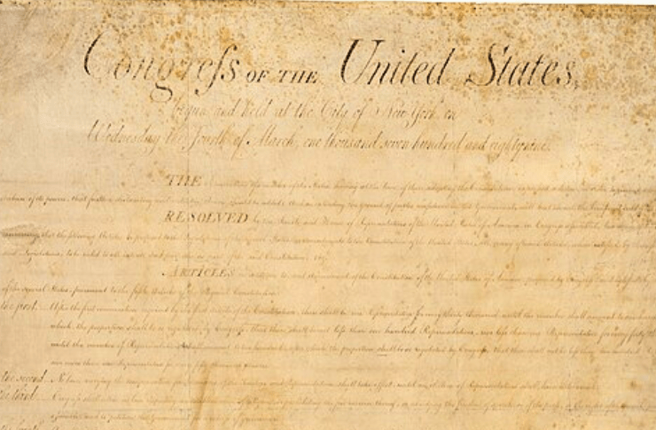
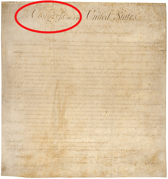
The very first line describes who’s speaking: “Congress of the United States, begun and held at the City of New York, on Wednesday the fourth of March, one thousand seven hundred and eighty-nine.”
And in the very first word of that phrase — “Congress” — the second to last letter looks suspiciously like a lowercase F instead of a lowercase S. Almost as though you would pronounce the word “congref.”
Medial means ‘in the middle’
What is this weird letter? Well, it’s called the medial S, or long S for short. Medial means “in the middle,” and between the 8th and 19th centuries, whenever the letter S appeared in the middle of the word, this elongated form was used.
The medial S looks like a lowercase F if you took away the bar across the center — or if the bar only stuck out on the left side.
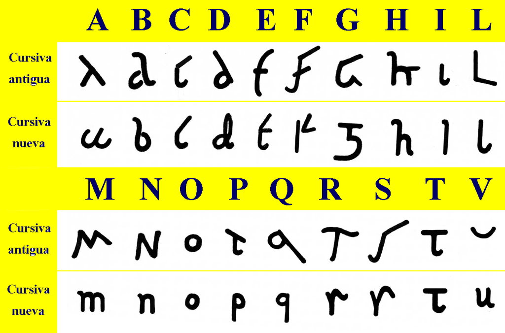
This form was a holdover from how the letter S was written back in ancient Rome. In Roman cursive, an S was drawn like a checkmark with a tail at the top that floated out to the right.
So why did English hang on to this long S—while still using a regular letter S—even though they both made the same sound? We don’t know, other than to say, “That’s how they did things back then.”
Rules for using the medial S
But what we do know is how the medial S was used.
It was used only to replace a lowercase S — never an uppercase S.
It was used when an S appeared at the beginning of a word or in the middle, as in “subject” or “reason.” It was never used at the end of a word, as in “lotus” or “hummus.”
If a double S was in the middle of a word, as in “possum,” two long Ss were used, making it look a lot like there are two Fs in the middle. But if a double S appeared at the end of a word, as in “bless,” a long S was paired with a regular S after it, so it looks like B-L-E-F-S.
That’s a lot to remember!
It’s worth noting that S wasn’t the only letter with mixed-up rules in Middle English, which spanned the 12th through 15th centuries. For example:
U and V were essentially the same letter. A V shape was used at the beginning of words and a U shape everywhere else—regardless of which sound you wanted to make.
The letter I was used for both the I and the J sound, though a capital J was occasionally thrown in at the beginning of a word.
Y was commonly swapped in for the letter I.
Finally, a silent E was added to the end of all kinds of words, not only to mark a long vowel like “place” or “bite.” It was added simply … for fun? Or for looks? We’ll never know.
Were all these rules confusing? Absolutely.
Medial S disappeared with the standardization of English spelling
In fact, this confusion spurred the push to standardize English spelling that started in the late 1400s. This push was reinforced by the introduction of the printing press in the 15th century. Printers began to standardize the spelling and punctuation of manuscripts in the name of simplicity. Their newfound ability to distribute multiple, identical copies of a manuscript reinforced this more consistent spelling, punctuation, and grammar across a wide audience.
Even with this push, it took quite a while for the medial S to disappear.
We can blame that partly on ligatures: two letters that are joined together on a piece of moveable type. SH, ST, and FS were common ligatures. Their use sped up the typesetting process and saved space on the printed page.
However, this meant that printers who wanted to drop the medial S couldn’t throw away one block of type. They had to replace every ligature that included a medial S. All these combinations had to be recast in metal, and the wooden cases that held printers’ type redesigned.
The nail in the coffin may have been the publication of “Bell’s English Theatre” in 1792. This compilation of plays, including Shakespeare’s, left out the long S.
This sent a signal to other publishers: if you’re not going to use old-timey letterforms in Shakespeare, why use them at all?
One final note. The medial S did stick around in handwriting even after it disappeared in print. We can see it in handwritten letters and documents up through the 19th century.
The medial S still lives in German … and in calculus!
Furthermore, it lives on today in the German double S (ß), a ligatured form that looks like a capital B. We also find it in calculus! The symbol for “integral” (∫) looks like an even more elongated medial S. The character [actually] comes from the S in the word “summa,” Latin for “sum.”
So that’s the story of the medial S. If you’re ever in Washington DC, stop by the National Archives and look at the Bill of Rights. You’ll get a first-hand look at the medial S taking center stage in one of the most important documents in U.S. history.
And finally, if you want to try out the medial S yourself, you can create it using the Unicode combination U+017F.
REFERENCES
Adams, Cecil. Why did 18th-century writers use F instead of S? The Straight Dope. Posted Nov. 6, 1981.
Barker, Richard. Late Modern English. History of English. Posted October 16, 2023.
Bear, Jacci Howard. Basics of Ligature in Typography and Publishing. ThoughtCo. Posted October 16, 2019.
CSU Northridge University Library. The Long S. Posted Jan. 22, 2019.
Gannon, Megan. Why does the letter ‘S’ look like an ‘F’ in old manuscripts? Live Science. May 26, 2019.
Kratz, Jessie. The Long S, in the U.S. National Archives Pieces of History blog. Posted Dec. 14, 2021.
Norman, Jeremy. The Gradual Disappearance of the Long S in Typography. HistoryofInformation.com.
Okrint, Arika and Sean O’Neill. Blame the Printing Press, pp. 116–146, in Highly Irregular: Why Tough, Through, and Dough Don’t Rhyme—And Other Oddities of the English Language. Oxford University Press, 2021.
Weiner, Edmund. Early modern English: grammar, pronunciation, and spelling. Oxford English Dictionary
Young, Mindy. Medial S: The Old English S That Looks Like F. Online Writing Jobs. Posted April 27, 2017.
IMAGE ATTRIBUTIONS
Bill of Rights – U.S. National Archives, Public Domain.
Roman Cursive – By Osado – Own work, Public Domain, Annual Report
.
Ligatures – Szczecinolog. This file is licensed under the Creative Commons Attribution-Share Alike 4.0 International, 3.0 Unported, 2.5 Generic, 2.0 Generic and 1.0 Generic license. https://commons.wikimedia.org/wiki/File:Latin_ligatures_(part_1).svg


