What Is a Pie Chart?
Did you know that a lot of people in the world think that pie charts are a terrible kind of chart? Keep on reading to find out why.
Jason Marshall, PhD
Listen
What Is a Pie Chart?

I love pie. And I love charts. So you’d think I’d really love pie charts. But while I’m not quite as big a hater of this workhorse of the chart industry as some (including, as we’ll see, a rather famous person in the data visualization world), I have to admit that I’m not super enamored with it either.
Why is that, you ask? In short, as we’ll see today, it’s because pie charts just aren’t that good at conveying the type of information that people want them to convey … at least not usually. Which is sort of a problem, don’t you think? But before we get to exactly what I and many other people have against pie charts, we’d first best figure out exactly what they are.
So let’s get started.
What Is a Pie Chart?
The number of pie charts that have been created in the history of the universe is roughly the same as the number of sand grains on Earth’s beaches. Pretty amazing stat, right? OK, I’m obviously kidding, but sometimes it feels like that. Because pie charts are everywhere: TV news, magazines, business presentations, billboards … everywhere!
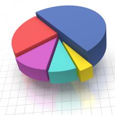
The idea behind a pie chart is simple: Take any set of data that breaks something down into a number of categories, and represent the relative sizes of those categories as proportionately-sized wedges of a metaphorical pie. As with every chart or graph, the whole purpose of creating such a visual aid is to make the information more easily digestible to the person you’re communicating with. In other words, the goal is simply to make it easier for somebody to comprehend the data you’re telling them about.
Occasionally pie charts do this well, but frequently they do not. To understand why, let’s begin by thinking about how pie charts are made.
How to Make a Pie Chart
To make a pie chart, simply open up Word or Excel or some other computer program of your choosing, then give it your data, and finally ask it to make a deliciously shaped chart. These days it’s just that easy to make a pie chart, which is probably why you see so many of them. But in the good old days before computers could do all the work for you, people had to make pie charts by hand. How?
Imagine surveying a bunch of people and asking them to name their favorite color. A researcher did just this and found that 42% of men claimed blue to be their favorite color, 25% favored green, 12% purple, 8% red, 7% orange, 5% yellow, and 1% pink. To turn this data into a pie chart, all you have to do is draw a circle and divide it into wedges that represent each choice. To find the angular size of each wedge, just multiply the percentage for that color by 360º. So the blue wedge should be 0.42 • 360º = 151.2º, the green wedge 0.25 • 360º = 90º, and so on with the purple, red, orange, yellow, and pink wedges taking up angles of 43.2º, 28.8º, 25.2º, 18º, and 3.6º. Once you’ve figured this out, you just have to use a protractor to draw your wedges, label them, and then share your amazing findings.
What’s So Bad About Pie Charts?
This seems like a pretty reasonable way to convey information. So why is it that the famous Yale professor and arguably most highly regarded data visualization expert in the world Edward Tufte had this to say of pie charts: “The only worse design than a pie chart is several of them.” That line from Tufte’s iconic 1983 book The Visual Display of Quantitative Information resonated with a lot of people, and you can find tons of articles on the web echoing Tufte’s sentiments. My brief search turned up articles with the titles: The Worst Chart In the World; Save the Pies for Dessertopens PDF file ; People, Please Stop Using Pie Charts; and, well, you get the idea.
“The only worse design than a pie chart is several of them.” (Edward Tufte)
The big problem with pie charts is simple: They often fail to do exactly that which they need to do—namely, they don’t make information more easily digestible. The main reason is that the wedges of the pie are often fairly similar in size. For example, the red, orange, and yellow wedges in the favorite color survey took up angles of roughly 29º, 25º, and 18º. If you look at an actual chart containing wedges of this size, you’ll find that it’s pretty hard to tell which of those wedges is bigger than the others. Because, as it turns out, humans just aren’t that good at judging the sizes of similar pieces of pie.
But the problems don’t stop there. Pie charts often include so many wedges—many of which are itty-bitty wedge-slivers—that it’s hard to dig through the mess to see what’s going on. Along those lines, many of those wedge-slivers end up being so itty-bitty that they get clumped together into one single “other” category which completely obscures their meaning. Then there’s the growing popularity of using very cool looking 3D versions of pie charts which have the unfortunate property of screwing around with the apparent sizes of the wedges due to perspective effects.
And on and on the problems go.
Alternatives to Pie Charts
The point is that with very few exceptions (most notably when you’re only comparing the sizes of two or three items), pie charts simply don’t make data easier to understand. In which case, what good are they? The answer is: not a lot.
A bar graph is probably a much better choice than a pie chart…
So what should you do instead? In most cases, Tufte simply recommends presenting the data as a table. It’s sort of an “if it ain’t broke, don’t fix it” situation—simply leaving the data in tabular format allows you to clearly see exactly how big each piece of the (now metaphorical) pie actually is, and it allows you to show all of the data without lumping a bunch into some “other” category. And if you still really want to present your data graphically, a bar graph is probably a much better choice than a pie chart since it gives you all of the same benefits just described for a table.
As Tufte tweeted: “Pie chart users deserve same suspicion+skepticism as those who mix up its/it’s, there/their.” While I’m not quite as upset at the pie chart as Tufte, I do agree that most of the time there is a better option.
Wrap Up
Until next time, this is Jason Marshall with The Math Dude’s Quick and Dirty Tips to Make Math Easier. Thanks for reading, math fans!
Pie chart image from Shutterstock.

